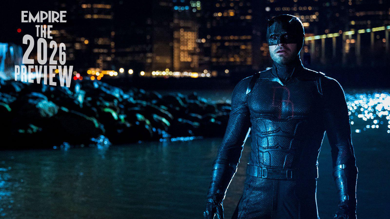
I think he was disappointed. He asked the costume maker to put a set of double D’s on his chest and this is what he got.
Burgoonius2025-11-19 00:20
🤣
intraumaticspiderman2025-11-17 21:52
DD - Don't Disappoint 😭
Long_Ganache_13352025-11-17 21:56
Wait, I see it, but the light is shining into the chest. That’s why the camera. Zoom in and look closer.
Front_Profession_2172025-11-17 21:58
I really didn’t mind if he didn’t had the DD logo, same thing with Tobey’s Spider-Man having organic web instead of the wrist machine webbing
OrganizdConfusion2025-11-17 23:15
They're not really the same. Spider-Man creating his own web building and wrist shooters highlights that he's more than just a teenager with superpowers. He's also a supergenius.
Front_Profession_2172025-11-17 23:35
That’s besides the point, my point is that as long as they stay true to the character of daredevil or Spider-Man, I could care less if daredevil doesn’t have the DD or Spider-Man having organic webbing
cereal_killah_19802025-11-17 23:56
Spider-man creating his own webbing is an example of a core characteristic: ingenuity.
Staying true to Spider-Man’s character means including his genius.
Organic webbing doesn’t showcase this at all.
OrganizdConfusion2025-11-18 08:23
[removed]
Front_Profession_2172025-11-18 09:24
The DD logo is the least of Daredevil’s worries, it’s not a requirement like having the bat logo on a Batman suit or Spider-Man having his spider logo on a Spider-Man suit, daredevil in the Netflix show was written with respect and written like in the comics, now was I bummed the DD logo wasn’t in the Netflix show? Yes I was, did I let it affect of how I love the Netflix show? Absolutely not, because the Netflix stayed true to Matt’s character, and that’s all that matters to me
SWPrequelFan815662025-11-17 22:05
now they have to figure out how to put em on the red suit
MandoLorian28102025-11-18 10:10
It's easy when you notice that the spray painted black suit is originally his red one
zerogamewhatsoever2025-11-18 14:56
Looks like it's just negative space then, the unpainted part that was left red. I kind of like it.
Burgoonius2025-11-19 00:20
I bet you when they do they won’t be red hehehehe
DonnyMox2025-11-18 14:08
THE DOUBLE D’S!
TheHondoCondo2025-11-18 14:16
I just don’t get what the appeal is. It’s the most generic possible emblem and he doesn’t need a symbol when literally the entire costume is a symbol. Maybe they justify it in the show, but we’ll see.
EightBiscuit012025-11-18 16:38
You could say the same thing for every single superhero. Why does Batman have a logo? Why does Spider-Man have a logo?
Because it’s cool
MrCatSquid2025-11-18 17:27
Those logos are cool because they’re Symbols, like a dope spider and a cool bat. the letters for logos don’t have nearly as much aura.
TheHondoCondo2025-11-18 17:31
Exactly! Even Superman’s, which is just an S, is at least stylized cool, and in some iterations it’s a kryptonian symbol, not technically an S, so it works even better then.
PerformanceSilent5272025-11-19 02:22
The D's are also nice looking on his chest, it gives a layer of style, it's literally also stylized so I am confused on what you mean.
[If it's not your style, that is cool. However people (including myself) find it cool looking, and gives DD more identity and swag.](https://imgur.com/a/hcMHXxg)
TheHondoCondo2025-11-19 04:05
Yes, they’re technically stylized because they overlap a little bit I guess. Sorry I think that’s incredibly underwhelming for a symbol.
PerformanceSilent5272025-11-19 04:37
Just hating at this point, logo looks incredibly sick, he does not need an animal on his chest for it look cool lmao.
TheHondoCondo2025-11-19 13:46
He doesn’t need anything on his chest to look cool. He already looks sick. I’m not just hating, I think the Ds detract from a cool costume. But I am willing to see if the show actually justifies it.
PerformanceSilent5272025-11-19 14:39
He does not look sick in the Netflix show lol, suit has no symbol, the colors are shit, the armor is too much.
TheHondoCondo2025-11-19 17:54
I think we’re gonna have to agree to disagree there.
PerformanceSilent5272025-11-19 02:19
DD symbol does look cool though, without the logo, it looks as if he's missing something. Same as Spider-Man not having a spider logo on his chest, it looks wrong, and makes the suit look generic.
TheHondoCondo2025-11-18 17:32
My point is that two overlapping Ds are not cool though and add nothing to the costume.
Commentaires
Staying true to Spider-Man’s character means including his genius.
Organic webbing doesn’t showcase this at all.
Because it’s cool
[If it's not your style, that is cool. However people (including myself) find it cool looking, and gives DD more identity and swag.](https://imgur.com/a/hcMHXxg)