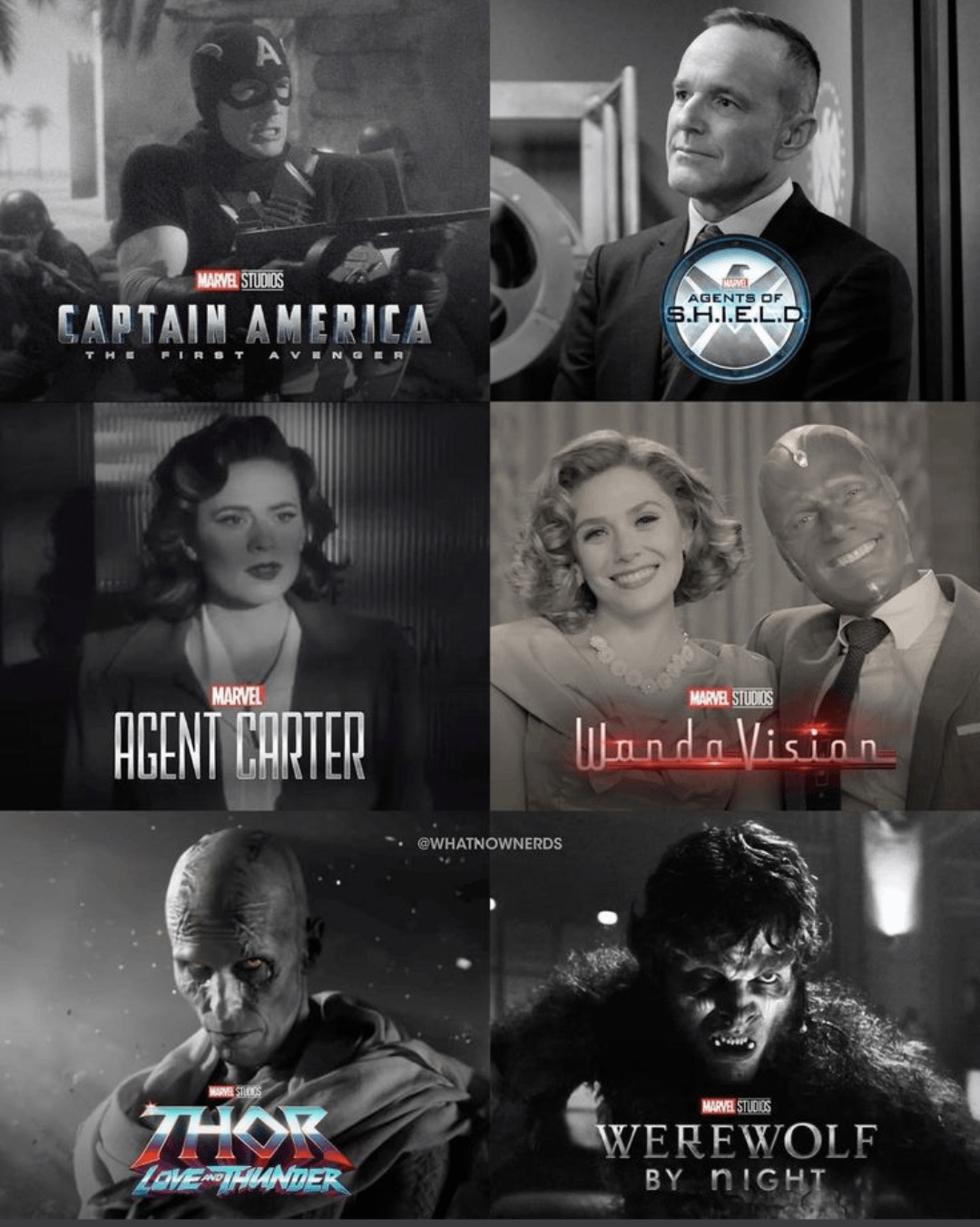
Which Mcu Project do you like that uses the Balck and white colour palette and aesthetic really well?
For me, it's Wandavision and Werewolf by night because they captured the time period that are used as the environment and rules within the context of each projects. Love and thunder is also really good when thor and friends fight Gorr on that planet that is full muted when the colour grading changes when they immediately get to him and it looks amazing as well. First Avenger is ok, we don't see a lot during his campaign montage, but it's good when it appears.
Commentaires
Werewolf by Night is my second choice. I was dumbstruck to see Disney+ advertising a color version! The black and white IS the atmosphere it sets the tone so well - a color version misses the point entirely.
of neo-noir style and Wanda Vision was a faithful recreation of vintage television.
So, you know like, all of those.
And then they the opposite of Minus One and released the colored version..
Werewolf by night for the genre.
Thor Love and Thunder for the scene.
2. Gore scene in Thor
3. WandaVision